By: Robert E. Brydia and Christopher J. Bratlien; Contributing Authors
In 2010, the Texas Department of Transportation (TxDOT) started a $2 billion reconstruction of I-35 in central Texas.
The 96-mile corridor carries more than 100,000 vehicles per day, with two-thirds of those traveling to final destinations outside the corridor to the north or south. That’s more than 30 million vehicle trips per year. With the estimated eight-year construction horizon (2010-2018), the impact would be felt across more than 250 million vehicle trips. In the daytime, 25–30% of the vehicles are trucks, rising to nearly 75% at night. When complete, the roadway will be expanded from four lanes to six in rural areas and to eight lanes in urban areas, with continuous one-way frontage roads.
Facing the challenges
In addition to the normal construction issues, such as phasing and access, TxDOT faces two more significant challenges: (1) Minimize the construction impacts to travelers and businesses and landowners adjacent to I-35 and (2) provide reliable real-time traffic information to I-35 travelers, businesses and freight operators to allow them to make informed travel choices. The eight-year horizon also is spread across 13 different construction projects awarded to multiple contractors.
TxDOT asked the Texas A&M Transportation Institute (TTI) to assist in the corridor by applying and refining prior research to help meet these challenges. As part of those efforts, TTI has designed, deployed and implemented an advanced construction traveler information system to keep the public informed, enhance safety and facilitate mobility during the multiple years of construction.
An effective public outreach program
The outreach developed to keep travelers informed on I-35 is a multifaceted approach involving traveler surveys, implementation of real-time sensors and communication technologies along the corridor, e-mail and social media outreach, and a visually appealing, interactive real-time traveler information website.
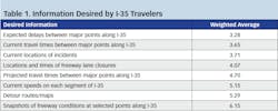
A significant input into the traveler information system (TIS) was the baseline survey performed to establish what type of information travelers considered most useful for the corridor, as well as the methods motorists typically use to obtain that information. More than 750 respondents completed the 16-question survey. They were asked to rank their information needs from most desired (1) to least desired (8). The weighted (by number of responses) results are summarized in Table 1. As seen on the first row, the lowest average represents the most desired information: Drivers want to know what delays they can expect between major points.
Dynamic signs and alerts
Fed by Bluetooth readers, en-route dynamic travel-time signs display information to the nearest major destination and update on five-minute cycles. Twenty-one signs are deployed across the 200 directional miles of the corridor. Daily e-mails (available by subscription) advise of lane closures along the route. E-mail subscription options also exist for a twice-a-week distribution showing the lane closures forecasted for the next seven days. Subscribers also can opt to receive alerts on high-impact-only (when all lanes in one direction would be closed) and incident alerts.
Real-time map
The most visible outreach component is the real-time traveler information map. From its inception, the real-time map used an innovative tabbed feature, which displayed the text-based listing of lane closures on the left, coupled with the traditional map with icons on the right. Over the timeframe of the planned enhancements, the tabbed framework has expanded to encompass other types of information, with the blueprint for numerous enhancements provided by the results from the traveler survey identified in Table 1.
The I-35 real-time map is among the most advanced public-sector traveler-information websites in the nation. Few real-time websites use the concept of text-based information displayed in conjunction with graphic information. Most websites simply have a number of graphical layers represented by icons on a map that can be turned on or off. This type of presentation makes it very challenging for a traveler to truly get an overview of their entire trip without hovering on each individual icon to read the information.
The I-35 map is more attuned to traveler’s needs and how people actually want to use information. Information can be delimited by direction, which affects the presentation of both the text in the left panes and the graphic presentation in the right map pane.
Figure 1. The I-35 central Texasreal-time traveler information map.
Figure 1 shows the map upon its initial loading on a standard desktop. Five tabs present information on lane closures, incident alerts, travel-time signs, a trip planner and weather.
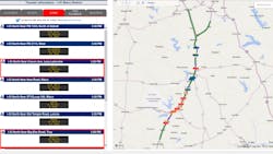
Figure 2. Lane closures delimited by direction.
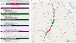
Figure 2 shows the same map where only northbound information is shown, having been delimited using the menu options available on the right-hand side. Both the graphical and textual information react to the menu choices across all tabs. Looking at Figure 2, a traveler can now easily identify any lane closures encountered during their northbound trip. The closures also are ordered by the latitude and longitude coordinates, so the top of the listing represents the closure closest to the northern part of the corridor. This allows a user to simply “travel” the corridor with their eyes, identifying those closures which might impact their trip.
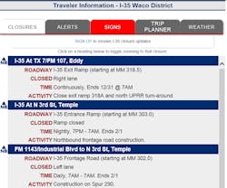
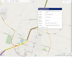
Figure 3 shows a close-up of the lane-closure detail. Each notice provides the specific cross-street location along the corridor, as well as the location relative to the nearest town, what type of facility is closed (main lanes, ramps, frontage roads, etc.), the starting mile marker of the closure, as well as the lanes, times and dates of the closure. A concise summary of the activity also is provided. Menu choices show closures for either a 24-hour window, a seven-day outlook or high-impact-only events. These options mirror the subscription-based e-mail lane-closure notices.
The map and other information outreach all follow common formats. Blue is always representative of northbound information, while green is southbound. Cross-street information is purple, and high-impact situations are always construction orange. Cross-street information is especially critical for business and local travelers. With numerous bridges being reconstructed across the interstate, local travelers, schools, businesses and emergency services depending on those routes need to be aware of the latest closure information to avoid delays. The map and e-mail distributions are tightly coupled, presenting the same information in the same format. E-mail distributions have hyperlinks that go directly to the detailed view of the closure (or incident), as shown in Figure 4.
Figure 3. Lane closure details.
Figure 4. Zommed closure details.
Innovative features
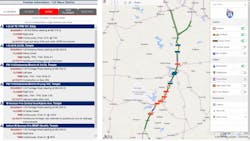
The map features numerous other innovations. When an incident is active in the corridor, or if there are travel-time delays, the corresponding tab turns red, providing a visual clue to viewers that something out of the ordinary is going on. Internal to that tab, the specific event is outlined in red. For example, travel times across segments that exceed 25% of their expected value turn red. At the same time, the icons on the map also turn red. These innovative alert mechanisms are shown in Figure 5.
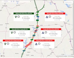
The map was enhanced in November 2014 with a real-time delay feature that allows a traveler to determine current delays in the corridor by major sections in a quick glance. Any sections exceeding the normal travel time are highlighted in red to alert the viewer to the abnormal situation. Figure 6 shows the real-time delay feature active on the map.
Figure 5. Innovative methods to alert viewers of abnormal situations.
Figure 6. The real-time delay feature
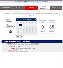
With the ability to show lane closures for the next seven days via the menu, the map is highly useful in planning future trips. The Trip Planner is a complimentary tool which allows a viewer to choose their starting and destination points, date of travel, and departure time. The planner then identifies the specific closures that the traveler will encounter during the trip and any anticipated delays. Figure 7 shows the planner tab for a northbound trip on Dec. 1 leaving at 7 p.m.
Figure 7. Trip planner tab.
Web page over an app
In the age of smartphones and “there’s an app for that,” new users often ask “why a web page instead of an app?” Simplicity is the answer. Developing a single source web page that contains all of the information and is responsive to both the device and the browser ensures that all the information is presented in one place across all user groups at the same time. Utilizing an application base would require three upgrade paths to occur simultaneously: web, devices running on the Android platform and devices running on the Apple IOS platform. Those simultaneous needs would almost certainly result in update delays for various user groups, leading to inconsistent information being presented to the public.
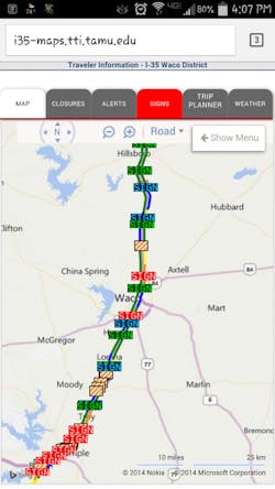
Figure 8 shows the smartphone view of the real-time map. The only difference from the desktop view is that due to the limited screen size, the right map pane is dynamically collapsed into a sixth tab titled Map. The rest of the information and operation is exactly the same as the desktop version. The decision point on when to collapse into a new tab is based on the screen width of tablet devices between the landscape and portrait modes. The operation can be seen on the desktop by simply reducing the width of the browser window and watching the map dynamically alter its appearance.
Figure 8. A smartphone view of real-time map.
Do travelers like/use the map?
The answer to this bipartite question is an emphatic “yes.” In follow-up surveys, respondents rate the information resources developed for the corridor highly favorable. The real-time map resource generates a 92% positive-response rating. In terms of interaction with the map, incidents rank the highest with 29% of all clicks, closures are next with 24%, followed by signs with 21%. The trip planner and weather tabs collect 16% and 10%, respectively. Views of the map have seen substantial increases in each quarter of the year, often tied to major incidents where travelers are looking for up-to-date information.
Advancing toward a third-generation TIS
Traveler-information systems (TIS) can be conceptually classified into three generations. The first generation is based primarily on a one-way broadcast of information to users, such as static mapping. The second generation provides a level of customized and/or interactive information to the traveler. Advanced features of a second-generation system include:
- Interactive user interface;
- Vehicle location and intelligent mapping;
- Individualized path search;
- Multimodal information;
- Dynamic route guidance;
- Location-based attractions search; and
- Real-time weather information.
A third-generation TIS is capable of recognizing the travel patterns and route preferences of a traveler, can evaluate network conditions with respect to these preferences, and then carries on a dialogue with the user to provide personalized route guidance.
As one of the most advanced and innovative publicly funded traveler-information resources in the nation, the I-35 real-time map has numerous elements of second- and third-generation systems and is poised to usher in a revolution in presenting comprehensive and useful traveler information with unprecedented ease of use. R&B
About The Author: Brydia is a research scientist with the Texas A&M Transportation Institute. Bratlien is a senior research specialist with the Texas A&M Transportation Institute.
